Her DoseCreating a brand that turned an uncomfortable conversation into an empowering one.
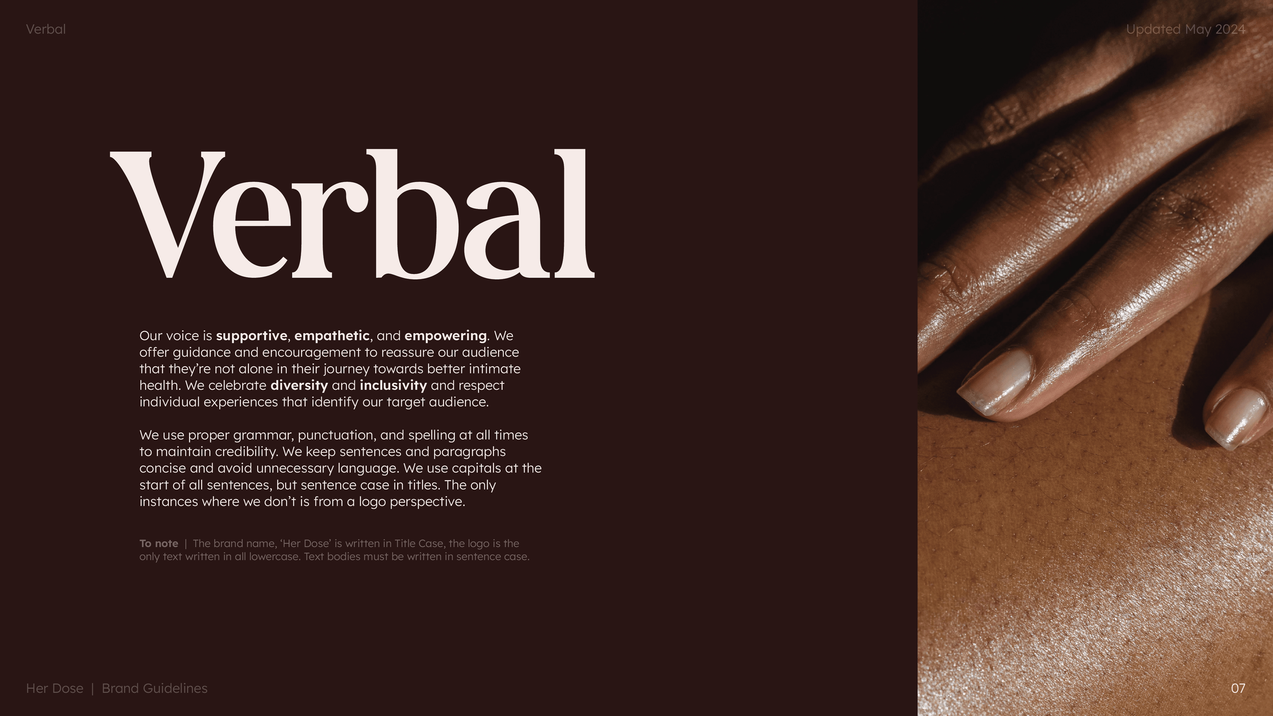
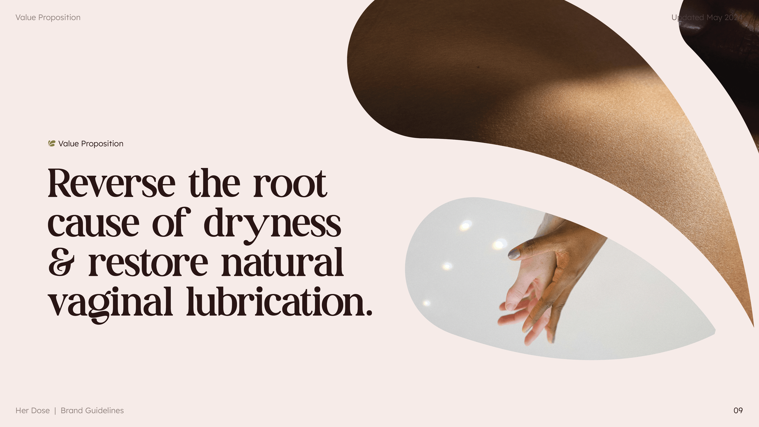
Her Dose was created to challenge the stigma surrounding women's intimate health. The goal was to develop a brand that felt educational, supportive and premium, while creating a safe space for women to discuss a topic that is often overlooked.
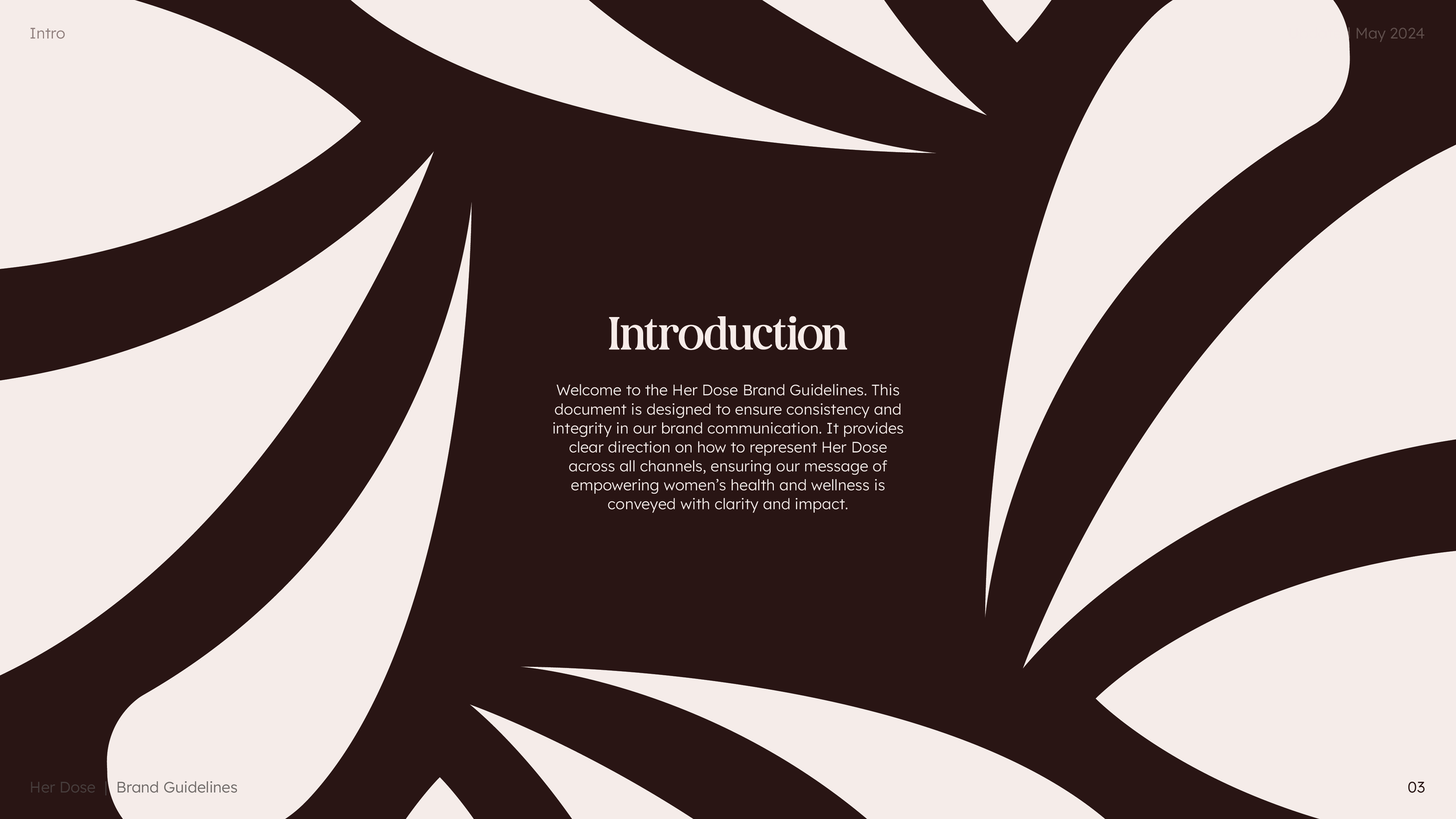
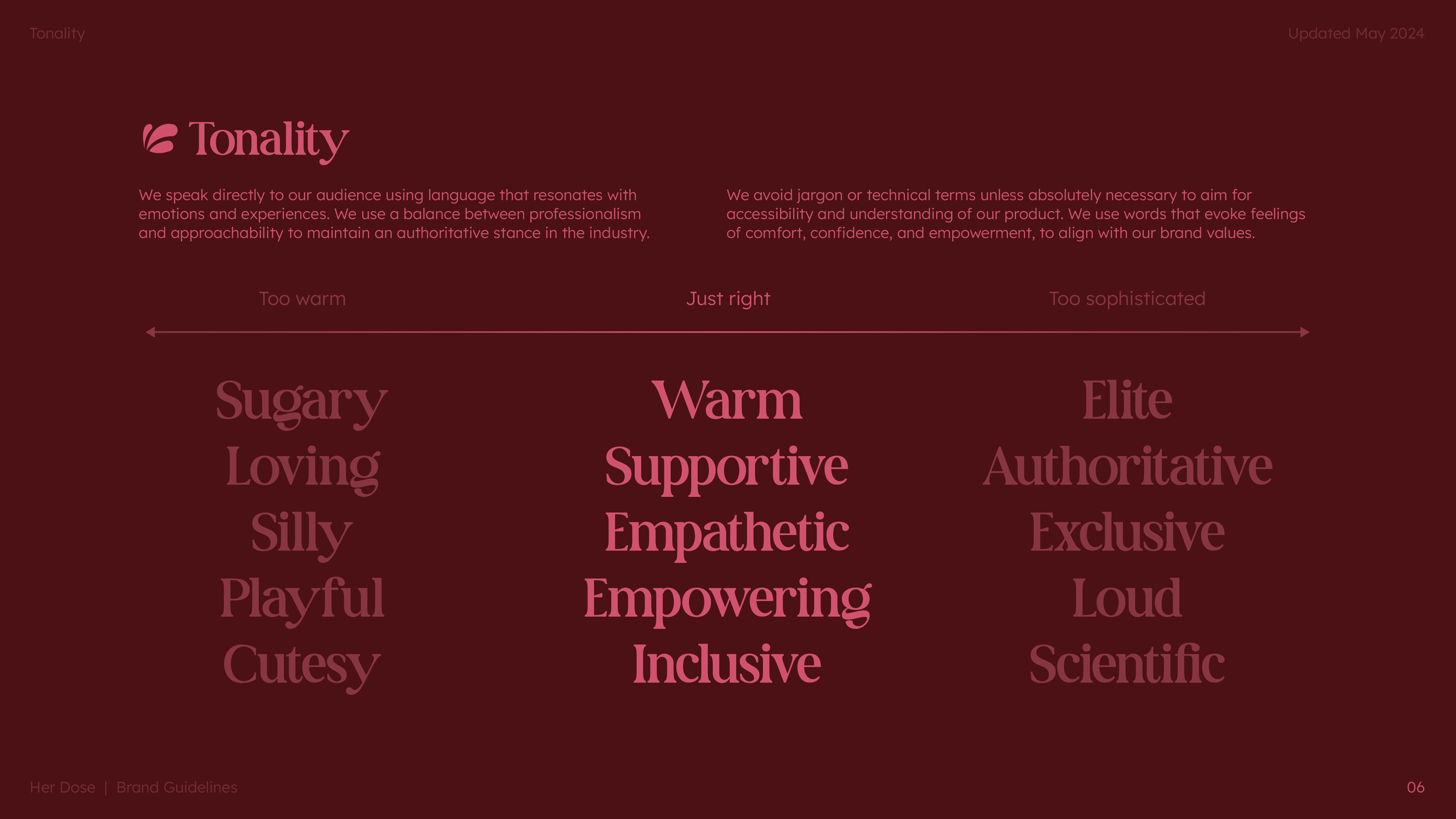
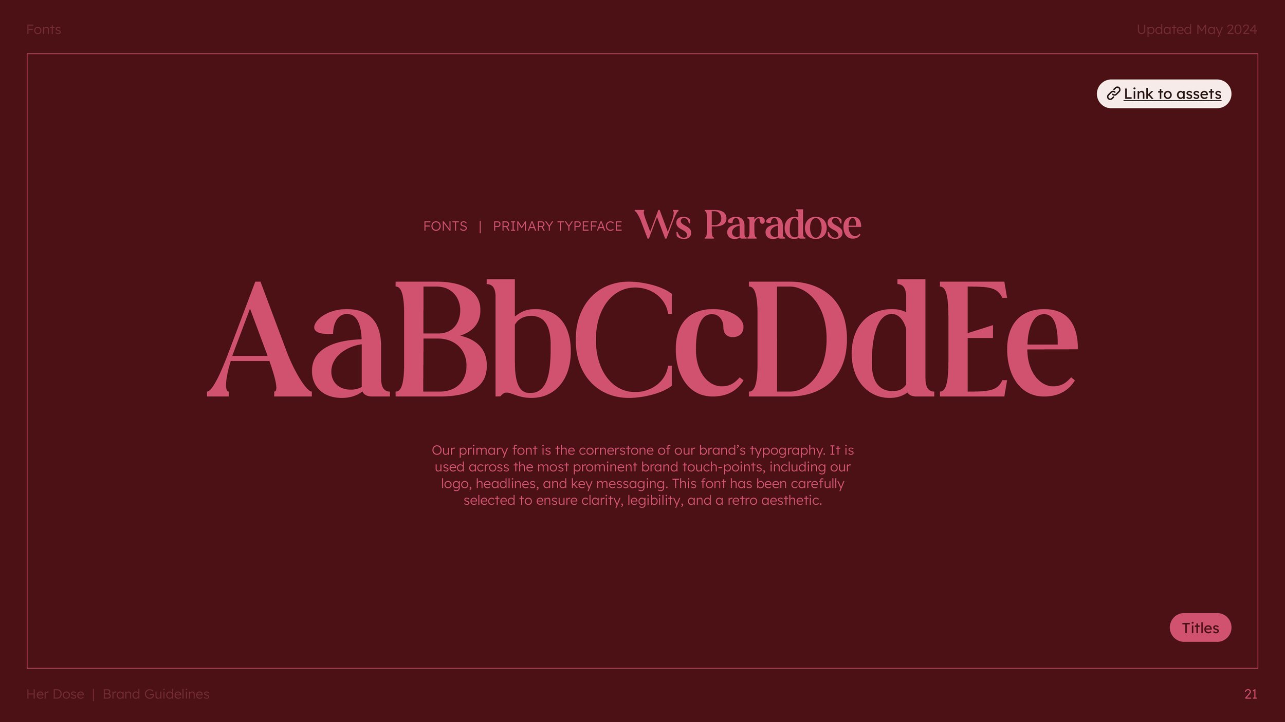
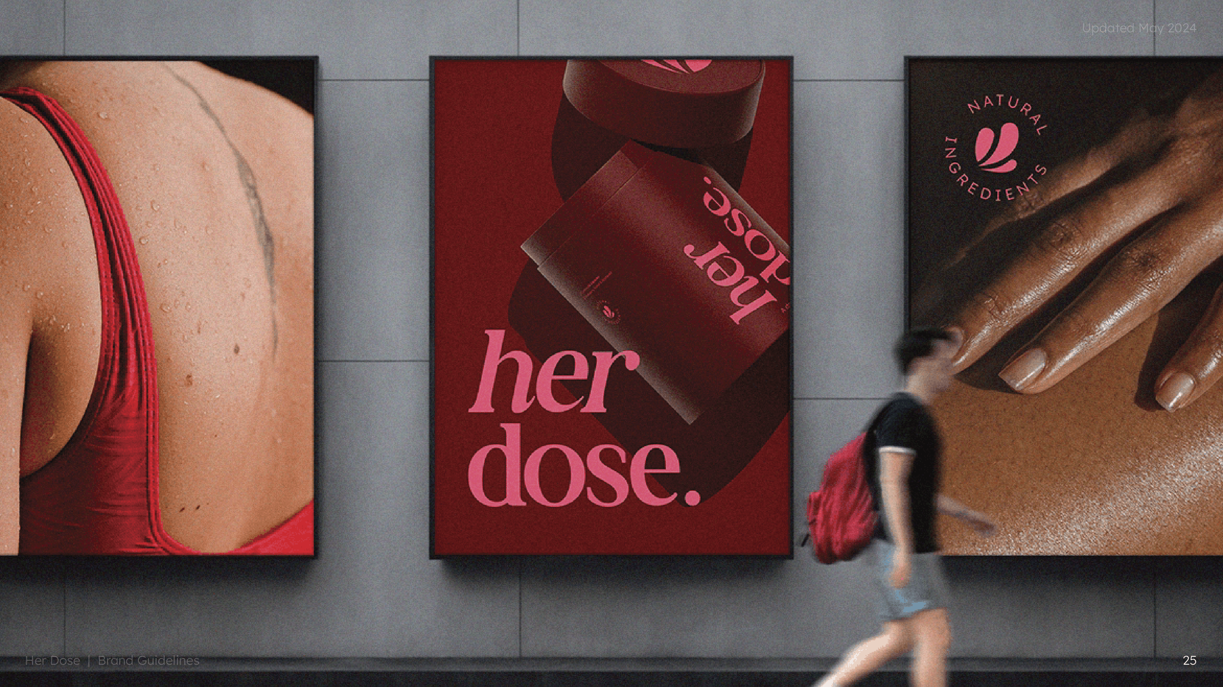
The visual identity balanced warmth with authority, combining rich, sophisticated tones with soft, organic shapes and honest messaging. Every touchpoint, from the website and advertising to the brand guidelines and customer personas, was designed to create consistency, build trust and empower women through education.
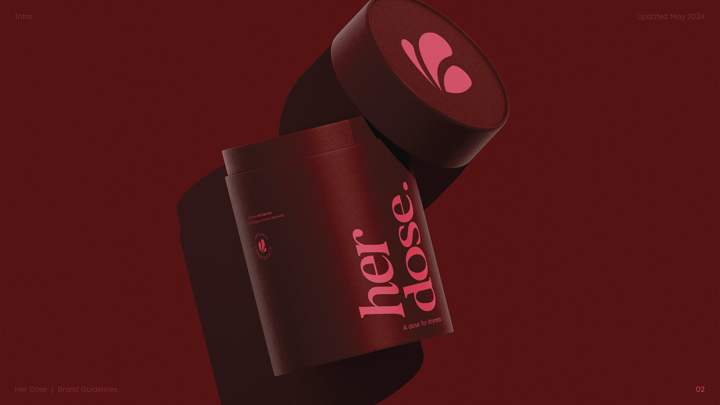
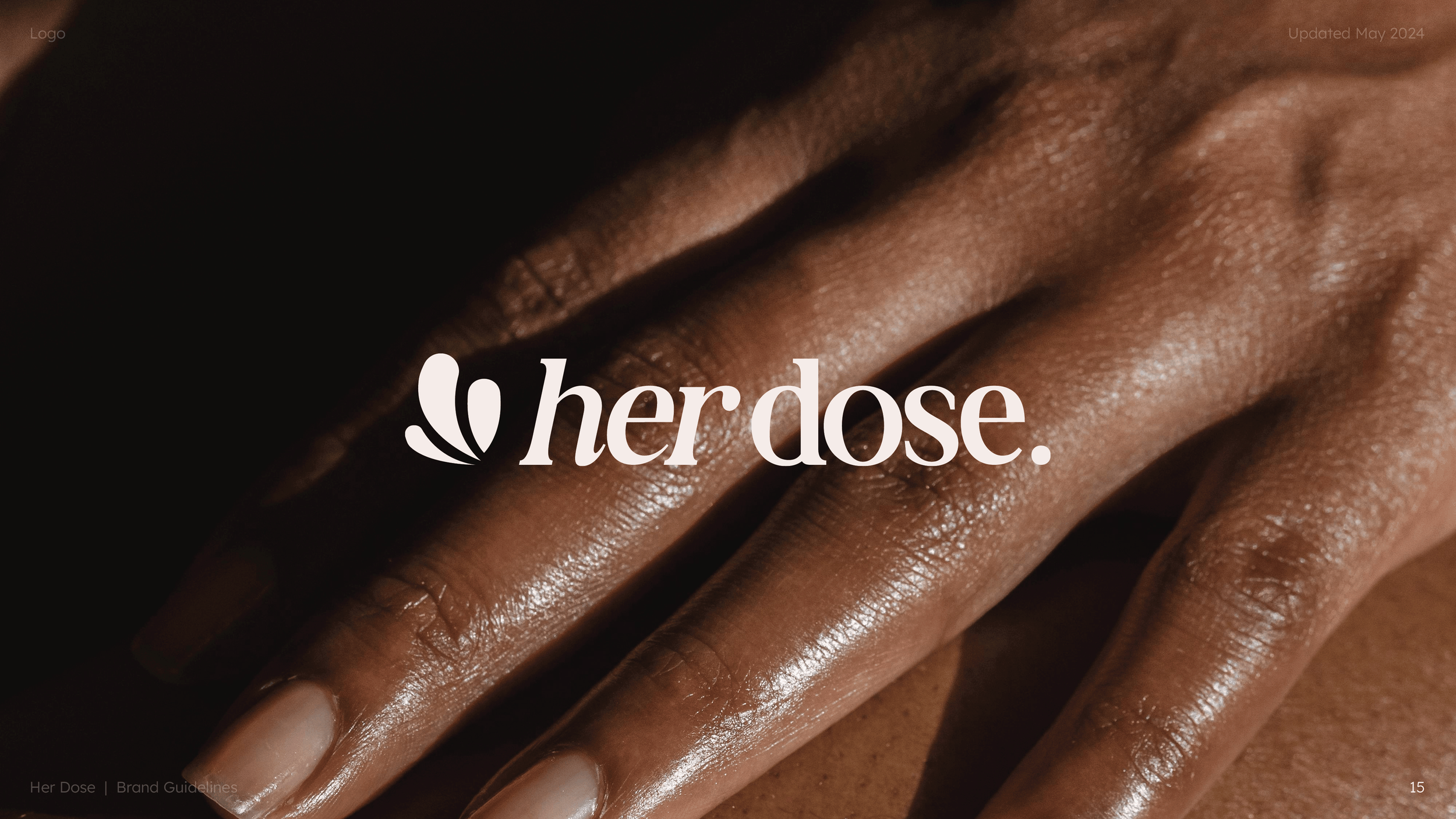
Exploring the logo.
For Her Dose, that idea was creating something that felt feminine without relying on clichés, premium without feeling exclusive, and educational without becoming overly clinical. The final identity became the foundation for the wider brand, influencing everything from the website and messaging to customer communications and marketing materials.